Dec 15, 2025
10 Features of High-Converting Mobile Donation Pages
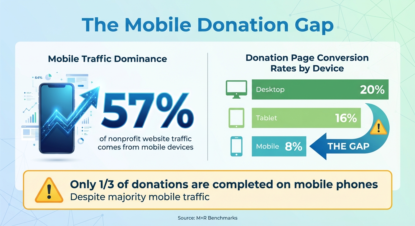
Your nonprofit's mobile donation page can make or break donations. With 57% of nonprofit website traffic coming from mobile devices but only a third of donations completed on phones, it’s clear: mobile experiences often fail to convert. Here's what you need to know to fix that:
- Responsive Design: Pages must adjust perfectly to any screen size, with large buttons and readable text.
- Fast Load Speed: Pages should load in under 3 seconds; slow speeds cause drop-offs.
- Simple Donation Forms: Limit fields to essentials - name, email, and payment details.
- Minimal Required Fields: The fewer fields, the better. Optional fields reduce friction.
- Multiple Payment Options: Include credit cards, PayPal, Apple Pay, and Google Pay.
- Clear Security Indicators: Use HTTPS, security badges, and reassuring messages.
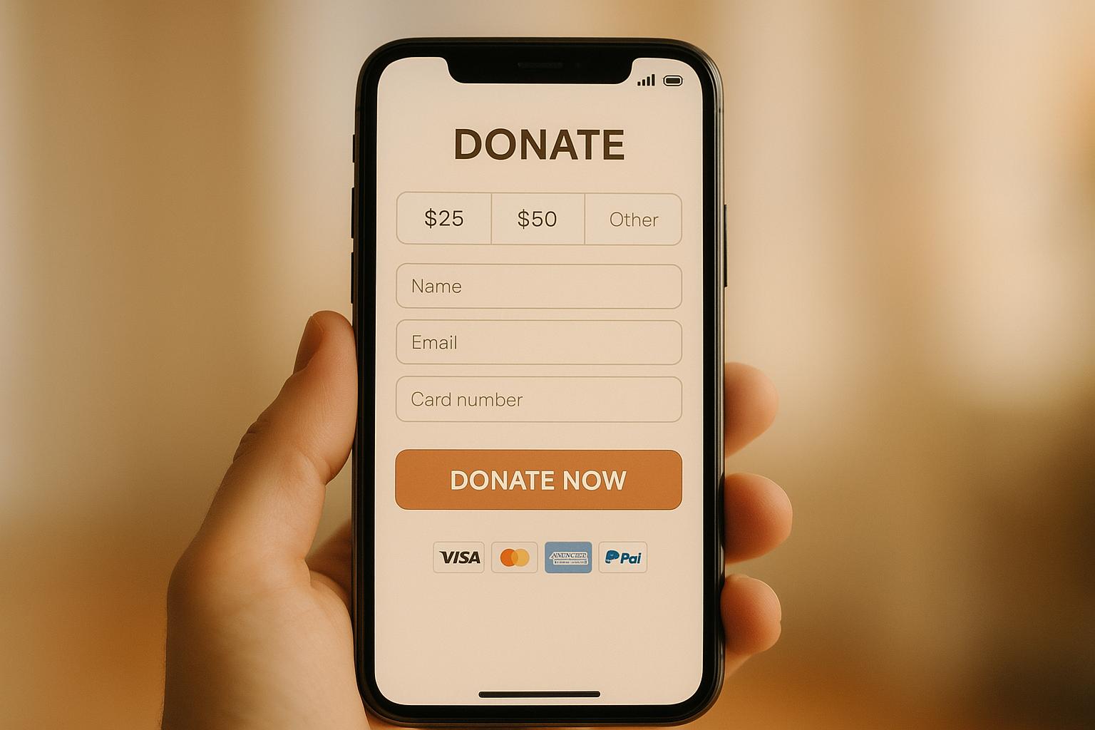
- Impact Messaging: Show exactly what donations achieve (e.g., "$50 feeds 10 families").
- Strong Calls to Action: Use bold, clear buttons like "Donate Now" with action-focused text.
- Recurring Giving Options: Offer monthly, quarterly, and annual plans with flexible settings.
- Mobile-Specific Features: Touch-friendly buttons, autofill, and streamlined layouts improve usability.
Mobile Donation Page Statistics: Traffic vs Conversion Rates
Is Your Donation Page Leaking Donors? Here’s How to Fix It
1. Responsive Design
Responsive design ensures your donation page works seamlessly on any device - whether donors are using an iPhone, an Android tablet, or a desktop computer. The layout, buttons, text, and images automatically adjust, so donors don’t have to pinch, zoom, or scroll sideways. This smooth experience can make all the difference in turning interest into immediate action.
When responsive design falls short, conversion rates take a hit. According to M+R Benchmarks, donation pages convert at about 20% on desktops, 16% on tablets, and only 8% on mobile devices. Why the drop-off on mobile? Small form fields, hard-to-read text, and unresponsive buttons often frustrate donors, causing them to abandon the process.
To counter this, responsive pages use single-column layouts, large tap-friendly buttons, and easy-to-read fonts. Buttons and form fields are designed to stretch across the screen, making them easier to tap, while text automatically resizes for readability. Tools like fluid grids and CSS media queries ensure the page adapts perfectly to any screen size.
A great example of this is the Coral Reef Alliance’s donation page (give.coral.org). Its clean, responsive design features bold imagery and a streamlined form. Studies from NextAfter show that removing distractions, like unnecessary navigation links, can increase donations by up to 195%.
To ensure your page performs well, test it on real devices using tools like Google’s Mobile-Friendly Test and BrowserStack. Tracking conversion rates separately for mobile, tablet, and desktop users can help identify areas for improvement. Even if your website isn’t fully optimized for mobile, make sure your donation form is - it’s often the only page a potential donor interacts with. Responsive design isn’t just a nice-to-have; it lays the foundation for everything else your donation page needs to succeed.
2. Fast Page Load Speed
After ensuring your donation page is mobile-friendly, the next priority is speed. When someone clicks on your donation link, every second counts. A delay of just a few seconds can mean the difference between receiving a gift or losing a donor. Experts suggest mobile donation pages should load in under 3 seconds to avoid frustration and drop-offs. Slow loading times are a major culprit behind donors abandoning their gift, especially on cellular networks or crowded public Wi-Fi connections.
So, how do you speed things up? Start with images - they’re often the biggest contributors to slow pages. Compress and resize images specifically for smartphone screens, and stick to one compressed hero image instead of using multiple large photos or autoplay videos. Modern file formats like WebP can help reduce file sizes without compromising quality. Also, cut down on unnecessary redirects by linking donors straight to your donation form from emails, texts, and social media, rather than sending them through a general landing page.
Your website’s hosting setup plays a big role too. Opt for U.S.-based data centers, SSD storage, and CDNs to minimize delays for donors in the U.S.. Choose a hosting provider that can handle traffic surges during major campaigns. If your analytics reveal high abandonment rates or you’re working with outdated technology, it may be time to upgrade your platform or hosting service.
Finally, test your page often. Tools like Google Lighthouse and Google PageSpeed Insights can help you identify issues. Go beyond simulations - test on actual devices to monitor mobile conversions, bounce rates, and the time it takes for users to interact with your page.
Need help implementing these changes? Partner with Share Services (https://shareservices.co) to fine-tune your donation page and turn more visitors into donors.
3. Simple Donation Form
A fast-loading page paired with an easy-to-use donation form is key, especially for mobile users. The simpler the process, the better. Every extra field or unnecessary step creates friction and risks losing potential donors.
Stick to the basics - name, email, donation amount, and payment details. For billing addresses in the U.S., consider using just the ZIP code to automatically fill in the city and state details. Avoid adding extra fields like phone numbers, surveys, or volunteer interests. Experts recommend keeping mobile forms to just 3–5 fields. Research consistently shows that fewer clicks and keystrokes make users more likely to complete the form.
Design matters too. A single-column layout with clear labels above each field works best. Placeholder text that disappears as users type can be confusing, so avoid relying on it. Make sure buttons and input fields are large enough for easy tapping - at least 16px font size - and leave enough space between elements to prevent accidental taps. Highlight the main action with a bold, high-contrast "Donate Now" button. Also, cut out distractions like navigation menus or sidebars to keep users focused on completing their donation.
To make the process even faster, enable browser auto-fill for fields like name, email, and address. Pre-fill the billing name based on donor contact details but allow for edits if needed. Use the right keyboard for each field - numeric for donation amounts and card numbers, and email-specific for email fields. These small tweaks not only speed things up but also reduce errors.
If your form still struggles with high abandonment rates, it might be time for a professional review. Share Services (https://shareservices.co) specializes in helping nonprofits improve their donation forms. Their team can identify problem areas and implement fixes to convert more visitors into donors. Their services start at $3,000 per month, offering a tailored approach to boost your conversion rates.
4. Minimum Required Fields
When it comes to mobile donation forms, simplicity is key. Every extra field you include is another potential barrier for donors. Mobile users expect speed and convenience, so stick to the essentials: name, email, and payment details like card number, expiration date, CVV, and billing ZIP code.
Studies show that complex forms can reduce completion rates by 10-20%. With 57% of nonprofit traffic coming from mobile devices, unnecessary questions can cost you donors.
Keep optional fields like phone numbers and full addresses just that - optional. For example, nonprofits such as the ASPCA focus only on the most necessary fields and include suggested donation amounts. Similarly, the Nebraska Greats Foundation uses tappable prompts and keeps inputs minimal.
To make the process even smoother, use auto-fill whenever possible. Pre-fill cardholder names but allow users to edit them. Set up the appropriate keyboard for each field - numeric for card numbers and donation amounts, and email-specific for email addresses. These small adjustments reduce errors and speed things up.
Still asking for details like company names, tribute information, or volunteer interests? Move those to a post-donation page or make them optional. Removing nonessential fields can significantly improve your conversion rates.
5. Multiple Payment Options
Making the donation process smooth and flexible is key to boosting mobile conversions. With over 33% of online donations coming from mobile devices, offering a variety of payment methods ensures donors can contribute without unnecessary hurdles, meeting their preferences and speeding up the process.
Include options like credit cards, PayPal, Apple Pay, Google Pay, and ACH transfers. Digital wallets, in particular, allow for quick, one-tap donations, eliminating the need for manual data entry.
To build trust and make the process seamless, display payment options as large, clearly labeled buttons, accompanied by trusted security badges. This visual reassurance encourages donors to complete their contributions with confidence.
For example, the Nebraska Greats Foundation effectively uses prominent payment buttons on its mobile forms, making it easy for donors to choose their preferred method and boosting engagement in the process.
You can also experiment with the order of payment options. If data suggests digital wallets perform better, consider placing them before credit card options to maximize conversions.
sbb-itb-deea482
6. Clear Security Indicators
Donors want to feel confident that their personal and payment information is safe. Clear and visible security signals can help ease concerns about fraud, especially for U.S. donors who are often cautious about entering their card details on mobile devices.
The first step is ensuring your donation page is secure. Use HTTPS with a valid SSL/TLS certificate - this is non-negotiable. Without HTTPS, browsers will display "Not secure" warnings, which can immediately scare away potential donors. Make sure the padlock icon is visible in the browser's address bar. This small but important detail establishes trust right from the start.
Next, incorporate security badges near key areas like the payment fields and the "Donate" button. Recognizable logos - Visa, Mastercard, PayPal, Apple Pay, and Google Pay - can provide instant reassurance. Add nonprofit verification seals, such as those from GuideStar, Charity Navigator, or BBB Accredited Charity. These badges should be easy to spot (at least 32x32 pixels) but avoid cluttering the page with too many elements.
Under the payment fields, include a simple message like, "Your donation is processed securely and encrypted." Pair this with a clearly labeled link to your "Privacy Policy." If you're designing for mobile users, consider using expandable sections or tooltips to provide extra details without overwhelming the screen.
Lastly, keep your donation form on your main domain (e.g., yourorganization.org/donate) and ensure the branding is consistent throughout. This continuity builds confidence and keeps donors focused. A great example is the Coral Reef Alliance’s donation page at give.coral.org. They maintain their logo and branding across the entire secure donation process, creating a seamless and trustworthy experience for donors.
7. Clear Impact Messaging
When it comes to mobile donors, decisions happen fast. That’s why it’s crucial to clearly show the impact of their donation right away. Instead of using vague phrases like "Support our mission", be specific about what each contribution achieves. For example, say something like: "$50 provides 10 hot meals for local families" or "$100 keeps our crisis hotline open for one hour, helping an average of six people access lifesaving support".
Once you've communicated the impact, guide donors directly to the donation form. Position your impact message immediately above the form, using simple, concise language. A donor-focused statement like "Your gift keeps a neighbor warm tonight" makes the contribution feel personal and urgent.
To take it further, link suggested donation amounts to tangible outcomes. For instance, selecting $25 could say, "provides fresh groceries for one family for a week." If costs vary, use wording like "helps provide" to stay transparent and build trust.
Visuals also play a big role in reinforcing your message. Use a real, high-quality photo of someone your nonprofit has helped - steer clear of generic stock images. Add a short caption, such as: "Thanks to donors, Maya received life-saving treatment". If you include a video, keep it brief (under 45 seconds), auto-muted, and optional.
Finally, test different headlines and examples to see what resonates most. Track which messages result in more completed donations and larger gifts. Share Services specializes in helping U.S. nonprofits ($1–$20M) fine-tune messaging to turn clear, compelling stories into measurable outcomes.
8. Strong Calls to Action
Your call-to-action (CTA) button is the final step between a mobile visitor and a completed donation. With nearly half of online donations now coming from mobile devices, your CTA needs to stand out and be easy to interact with. It’s the last push that turns interest into action, so its design and messaging are crucial.
Start with a button that’s easy to tap - think large, thumb-friendly dimensions (at least 48 pixels tall) and a high-contrast color that grabs attention and doesn’t blend into the rest of the page.
The text on your CTA matters just as much as its design. Use action-driven phrases like "Donate Now", "Make a Difference Today," or "Give Today" to create a sense of urgency and inspire immediate action. Avoid vague wording; be clear about the desired action. For recurring donations, phrases like "Give Monthly" or "Become a Monthly Partner" help set expectations about the commitment involved.
Placement is key. Position your CTA prominently at the top of the page and repeat it after your impact story for maximum visibility. A single-column, vertical layout - starting with your story, followed by the form, and ending with a bold CTA - naturally guides the viewer’s focus on smaller screens.
To address any hesitation, include reassuring microcopy near the button. Short phrases like "Secure, encrypted payment" or "Takes less than 60 seconds on your phone" can ease concerns and build trust. You can also connect the CTA to the donor’s impact. For instance, adding a line like "Your $35 provides school supplies for one student" just above the button reminds donors why their contribution matters.
Finally, don’t be afraid to experiment. Test different versions of your CTA - try tweaking the wording, color, or placement - and track your results to see what works best. Even small adjustments can lead to noticeable improvements in mobile donations. Jasmine Morse from the Advancement Department shares her experience:
"Share helped us test simplified + focused messaging that improved our conversion rates, and their recurring giving pop-up brought in almost 100 new monthly gifts. We've continued to see success with both of these strategies in other campaign efforts."
9. Recurring Giving Options
Recurring donations turn one-time donors into consistent supporters, creating a steady and predictable revenue stream. This reliable income makes planning easier and ensures nonprofits can respond promptly to needs. When donors commit to giving monthly, quarterly, or annually, they provide ongoing "set it and forget it" support, significantly increasing their lifetime contribution value. Here’s how to make recurring donation options more effective on your mobile page.
Start by offering multiple frequency options - monthly, quarterly, and annual - with monthly as the default. Monthly giving is the most intuitive for U.S. donors and fits well into most budgets. Make these frequency controls easy to spot, such as a clear toggle for "One-time / Monthly / Quarterly / Annual", so donors encounter the options before entering payment details. While highlighting the monthly option visually, ensure switching back to one-time giving is straightforward to avoid negatively impacting conversions.
Tie donation amounts to specific, tangible outcomes. For example, "Give $25 monthly to provide school supplies for one student every month" is far more compelling than a generic appeal. Adding a simple note like, "Change or cancel anytime," can also ease concerns about long-term commitments.
Consider using a "Donate Monthly" pop-up to encourage recurring gifts. Data shows this can increase monthly donations by 64%, yet only 16% of nonprofits take advantage of this feature. For instance, after a donor selects a one-time gift, suggest an alternative like: "Would you consider $15/month instead of a one-time $50 gift?" This approach makes monthly giving feel manageable while building on the donor’s existing intent.
On the technical side, ensure your payment system supports automatic monthly billing and features like card updater services to minimize churn when credit cards expire. Accept a variety of payment methods, including major credit cards, ACH transfers, and digital wallets like Apple Pay and Google Pay. Regularly track key metrics such as the recurring selection rate, average monthly gift size, and 12-month retention rate to fine-tune your approach.
For nonprofits aiming to enhance their recurring donation programs, expert help can make a big difference. Partnering with organizations like Share Services (https://shareservices.co) can provide valuable insights, from auditing your mobile donation process to refining messaging and implementing best practices for sustained donor engagement.
10. Mobile-Specific Features
When it comes to creating a donation page that works seamlessly for mobile users, having a responsive design is just the start. Mobile-specific tweaks are what truly make the experience smooth for donors on the go. Considering that 57% of nonprofit website traffic now comes from mobile users, it’s surprising how many donation pages still look like shrunken versions of their desktop counterparts. This difference isn’t just cosmetic - it can be the deciding factor in whether someone completes their donation or abandons the process halfway.
To start, make sure your page includes touch-friendly buttons. These should be at least 48 pixels wide to prevent frustrating mis-taps. A clean, vertical, single-column layout tailored for smaller screens eliminates the need for pinch-to-zoom or horizontal scrolling. And don’t forget high-contrast colors for text and buttons - this ensures readability even in bright outdoor conditions.
Streamlining input fields is another must. Enable autofill and use smart input types, so donors can quickly populate fields with a single tap. This reduces errors and speeds up the process. These adjustments go beyond responsive design by addressing the unique challenges mobile users face.
Payment options are just as important. Integrating mobile-friendly payment methods like Apple Pay, Google Pay, and PayPal can make a huge difference. With these digital wallets, donors can check out in seconds using biometric authentication - no need to manually enter card details. These tools also auto-fill billing information, making the entire process quick and painless. Displaying preset donation amounts (e.g., $25, $50, $100) further simplifies decision-making and speeds things up.
Finally, performance testing is critical. Test your donation page on actual devices to ensure images load fast, text is easy to read without zooming, and fields are simple to tap. Aim for a page that loads in under three seconds, with images under 100KB and generous tap areas. For nonprofits looking to take their mobile experience to the next level, working with experts like Share Services (https://shareservices.co) can help. From auditing your current setup to designing templates and integrating payment systems, they can ensure your page is truly mobile-ready.
Conclusion
Building a mobile donation page that truly converts isn’t about cramming in every possible feature - it’s about focusing on the essentials. By integrating 10 key elements - like responsive design, fast loading speeds, simplified forms, fewer required fields, multiple payment options, visible security features, impact-driven messaging, strong calls to action, recurring donation options, and mobile-specific enhancements - you can create a seamless experience. When these elements work together, they remove barriers, build trust, and align with the expectations donors already have from apps they use every day, like banking or shopping platforms.
The numbers tell the story: with 57% of nonprofit website traffic now coming from mobile devices and about one-third of donations completed on phones, an ineffective mobile page could cost your nonprofit valuable donations. If your page feels slow, cluttered, or untrustworthy, donors are likely to abandon their contributions before completing them.
So, where should you start? Create a 30-day plan to assess and improve your page. Test it on various mobile devices, aim for load times under three seconds, and simplify your forms by removing unnecessary fields. Ensure your "Donate" button is prominent and easy to tap. Offer popular payment methods like credit cards, Apple Pay, Google Pay, and PayPal. Enable recurring giving with pre-set amounts - $25, $50, or $100 - and prominently display security badges alongside concise impact statements (e.g., "$50 provides meals for a family of four").
Once the initial fixes are in place, commit to ongoing improvements. Conduct quarterly audits, test your page on both iOS and Android, and use A/B testing to fine-tune headlines, calls to action, and donation amounts. Keep an eye on critical metrics like mobile conversion rates, average gift sizes, recurring gift sign-ups, and page load times.
If your nonprofit doesn’t have the resources to handle these updates internally, consider partnering with experts like Share Services. They specialize in digital fundraising, donor retention, and mobile-optimized campaigns specifically designed for mid-sized U.S. nonprofits. The goal is clear: make donating fast, easy, and secure on any device - and continue refining the experience as donor expectations evolve.
FAQs
What can I do to make sure my nonprofit's mobile donation page loads faster?
To make sure your nonprofit's mobile donation page loads fast, it's essential to fine-tune its performance. Start by compressing images and videos to shrink file sizes without sacrificing quality. Trim down unnecessary code and scripts that might slow things down, and choose a dependable hosting provider to keep things running smoothly. You might also want to consider using a content delivery network (CDN). A CDN helps distribute your page's content across multiple servers, ensuring quicker load times for users no matter where they are. Prioritizing speed not only makes the browsing experience better but also boosts the chances of receiving donations.
How can I make mobile donation forms easier to use?
When designing mobile donation forms, aim for a simple and user-friendly layout that keeps distractions to a minimum. Stick to just the necessary fields, so donors can complete the process quickly and without hassle. Use clear and concise language to guide users, and offer various payment options to cater to different preferences. It's also crucial to ensure the page loads fast and employs secure payment methods to establish trust and create a smooth experience for donors.
Why should mobile donation pages offer multiple payment methods?
Providing a variety of payment options on mobile donation pages is key to making the giving process smooth and welcoming for everyone. Whether donors prefer using a credit card, a digital wallet, or another method, having these choices available makes donating easier and more convenient.
Offering this kind of flexibility eliminates potential barriers that might prevent someone from completing their donation. It also encourages more people to give, boosting fundraising efforts. By accommodating different preferences, you not only make the process simpler but also strengthen trust and deepen relationships with your supporters.
Related Blog Posts
Get helpful resources, straight to your inbox
We love sharing tools, ideas, and stories that make nonprofit work a little lighter and a lot more effective. Sign up below and we’ll send you practical tips, free resources, and a bit of encouragement—because the work you’re doing matters.
No spam. Just good stuff for good people.