Nov 14, 2025
5 Common Donation Page Design Mistakes
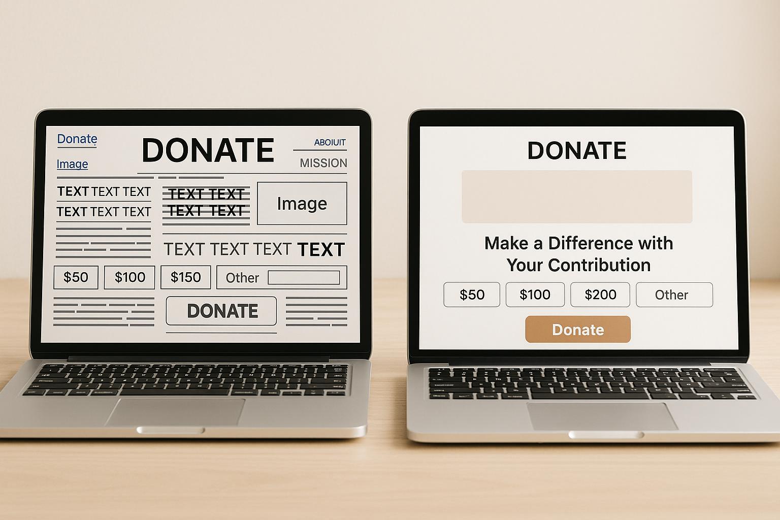
Your donation page is where potential donors turn intent into action. But poor design choices can create frustration, erode trust, and lead to abandoned donations. Here are five common mistakes nonprofits make - and how to fix them:
- Inconsistent Branding: Mismatched colors, fonts, or missing logos confuse donors and lower trust. Keep your branding consistent across your main site and donation page.
- Long, Complex Forms: Overly detailed forms overwhelm donors. Stick to essentials like name, email, donation amount, and payment details.
- Poor Mobile and Accessibility Design: With over 50% of donations coming from mobile devices, ensure pages load quickly, buttons are easy to tap, and accessibility features like alt text and readable fonts are in place.
- Limited Payment Options: Donors expect flexibility. Include options like credit cards, PayPal, Apple Pay, and recurring donations.
- Lack of Confirmation and Follow-Up: Immediate thank-you messages and updates reassure donors and build loyalty.
Key Takeaway:
Simplify the process, maintain trust through branding, and provide multiple payment options. These small changes can increase donation completion rates and strengthen donor relationships.
Give LIVE: 5 Ways Your Donation Page Could Be Failing Your Donors
Mistake 1: Missing or Inconsistent Branding
Imagine this: a supporter, inspired by your mission, clicks "Donate" on your website. But instead of being greeted by the familiar look and feel of your organization, they're taken to a generic page with mismatched colors, fonts, and no logo in sight. That moment of disconnect can shatter trust - right when it matters most.
When your donation page lacks consistent branding, it creates uncertainty. Donors may start to question whether their payment information is safe or if their contribution will even reach the intended cause. Research shows that donation pages with consistent branding can achieve up to a 30% higher completion rate compared to those with generic or inconsistent designs. For a nonprofit raising $500,000 annually, this could translate to an additional $150,000 in donations - all by ensuring visual consistency.
Why Branding Matters
Branding isn't just about looking polished - it’s about building trust. Familiar colors, fonts, and logos signal continuity, reassuring donors that they’re still engaging with the same organization they believe in. This sense of familiarity fosters confidence, especially at the critical moment of completing a donation.
But branding goes beyond visuals. Your logo and design elements represent your mission and values. When donors see these on your donation page, it rekindles the emotional connection that initially inspired their generosity. A consistent brand presence can be the difference between a completed donation and someone abandoning the process.
Even the mood of the page plays a role. If your main website uses warm, inviting colors to reflect a community-oriented mission, but your donation page features cold, corporate tones, it disrupts the emotional journey. Donors might feel like they’ve suddenly been redirected to a generic payment processor instead of continuing their support for a meaningful cause.
How to Fix It
Start by comparing your website and donation page side by side. Do they feel like they belong to the same organization? If not, it’s time to make some changes.
- Match your branding elements: Use your official logo, color hex codes, and fonts exactly as they appear on your main website. One U.S.-based nonprofit saw a 20% increase in completed donations after aligning their donation page design with their website.
- Keep donors on your domain: Whenever possible, ensure your donation page stays on your primary domain. If you’re using an external processor, make full use of customization options to maintain your brand identity.
- Test for consistency across devices: Ensure your branding remains intact whether donors are accessing the page on a desktop, tablet, or smartphone.
- Reinforce your mission: Add a short mission statement or impact message to the donation page. This not only strengthens the emotional connection but also ties in with the language and tone of your main website.
Maintaining consistent branding isn’t just about aesthetics - it’s about trust, emotion, and ultimately, donor retention. For nonprofits needing support, Share Services offers tools to create cohesive branding across all digital platforms, ensuring your message resonates at every touchpoint.
Mistake 2: Complex or Long Forms
Picture this: a passionate donor decides to contribute $50 to your cause. They click "Donate", ready to support you, only to be faced with a daunting form asking for a laundry list of personal details marked with red asterisks. By the time they’re halfway through, they start questioning whether it’s worth the effort. This scenario happens far too often. In fact, form abandonment rates can top 50% when donation forms are overly long or complicated. What starts as enthusiasm quickly turns into frustration, leaving donors to walk away without completing their gift.
But the impact goes beyond just losing donations. When donors encounter unnecessarily complicated forms, they may view your organization as inefficient or even question how you’ll handle their private information. Excessive data requests can feel intrusive, breaking trust and discouraging not only the current donation but also future support. First impressions matter, and a poorly designed form can leave a lasting negative one.
Problems with Long Forms
The psychology here is simple: people want to give, but they don’t want to jump through hoops to do it. Every extra field or step increases the risk of abandonment.
Imagine a donor starts filling out your form, entering their name and email with excitement. Then, they’re hit with a wall of required fields: home address, work address, phone number, date of birth, employer details, and even their spouse’s information. Naturally, they start asking themselves, “Why do they need this?” or “Is my information safe?” Progress indicators like “Step 2 of 5” can add to the anxiety, making the process feel endless and uncertain.
Simple Form Design
The fix is straightforward: keep it simple. Research shows that shorter forms with fewer required fields can boost completion rates by as much as 50%. Focus on collecting only the essentials - typically the donation amount, donor’s name, email address, and payment details. If you need more information, you can always gather it later.
Make additional fields like phone numbers, mailing addresses, or employer information optional, or save them for follow-up communications. For example, one nonprofit reduced its donation form from 12 fields to just 4 essential ones and saw a 35% increase in completed donations within three months. This not only improved conversion rates but also earned positive feedback from donors who appreciated the simplicity.
Design also plays a big role. Use a single-column layout with large, easy-to-tap buttons for both desktop and mobile users. Replace overly formal phrases like “Electronic mail address” with “Email” and “Monetary contribution amount” with “Donation amount.” Clear, direct language speeds up the process and reduces confusion. When extra fields are unavoidable, brief tooltips or explanations can reassure donors and build confidence.
For U.S.-based donors, display amounts in dollars ($), use the MM/DD/YYYY date format, and ensure the text is legible without requiring zooming.
Regularly test your donation form to find and fix any friction points. Try completing it yourself on different devices, and ask colleagues or board members to do the same. Take note of any moments where they hesitate or feel confused. A streamlined form isn’t just about convenience - it’s about maintaining the trust you’ve worked hard to earn.
"Share helped us test simplified + focused messaging that improved our conversion rates." – Jasmine Morse, Advancement Department
If you’re looking for expert help, Share Services offers tailored digital fundraising solutions for nonprofits with revenues between $1-$20M. Their approach focuses on optimizing donation pages, improving conversion rates, and ensuring mobile-friendly designs - all while keeping donor trust and satisfaction at the forefront.
Ultimately, donation forms should be fast, secure, and easy to use. By respecting your donors’ time and simplifying the process, you’re not just increasing the number of completed donations - you’re building trust and loyalty that lasts.
Mistake 3: Poor Accessibility and Mobile Design
Imagine this: a supporter with a visual impairment tries to donate to her favorite nonprofit using a screen reader but runs into multiple roadblocks. The donation page has no alt text, poor color contrast, and inaccessible buttons. Frustrated, she gives up. Meanwhile, Mark, eager to donate $25 on his smartphone during lunch, struggles with tiny buttons, unreadable text, and a slow-loading form. He also abandons the process.
These scenarios highlight a critical issue. With many individuals living with disabilities and over half of donors giving via smartphones, ignoring accessibility and mobile-friendly design can result in lost donations. In fact, nonprofits risk losing up to 50% of potential donors due to overly complex or poorly designed donation pages.
Accessibility Basics
Making a donation page accessible is not just about meeting legal requirements - it’s about ensuring that everyone who wants to contribute can do so without frustration. Fortunately, the steps to achieve this are simple and impactful.
- Alt text for images is essential for visual accessibility. Every image, icon, or graphic on your page should include descriptive alt text that screen readers can interpret. Avoid generic file names or unlabeled images - use clear, meaningful descriptions that provide context and relevance.
- Readable fonts, high contrast, and keyboard-friendly navigation are key. Stick to simple fonts like Arial, Helvetica, or Georgia, and ensure text contrasts sharply with its background. The Web Content Accessibility Guidelines (WCAG) 2.1 recommend a contrast ratio of at least 4.5:1 for normal text. Form fields should include clear, persistent labels (not placeholder text that disappears) and follow proper heading structures (H1, H2, H3) for easier navigation.
Tools like WAVE or axe can help identify common accessibility issues, but manual testing is equally important. Use screen readers like NVDA or try navigating your site with just a keyboard to uncover hidden challenges.
Mobile-Friendly Design
After tackling accessibility, shift your focus to mobile optimization. With smartphone donations on the rise, a smooth and convenient mobile experience is a must.
- Responsive design and fast load times are non-negotiable. Use layouts that adapt to any screen size, ensure body text is at least 16 pixels for readability, and size buttons to around 44 pixels square for easy tapping. Mobile users expect pages to load in about three seconds, so compress images, minimize scripts, and leverage content delivery networks to speed things up.
- Vertical form layouts work best on mobile devices. Stack form fields and keep required information minimal to avoid frustrating users. Mobile-specific input types - like numeric keypads for donation amounts or email keyboards for email fields - make the process even smoother.
One nonprofit revamped its website with these principles in mind, introducing responsive forms, clear donation calls-to-action, and QR codes for added convenience. The result? A significant increase in mobile donations and stronger donor engagement. Another organization simplified its donation process while ensuring mobile compatibility, reducing form abandonment by 30% and boosting completed donations by 20% within just three months.
Test and Refine
Regular testing is crucial. Try completing your donation process on a variety of devices - smartphones, tablets, and different browsers - and gather feedback from board members, volunteers, or community members with disabilities. This hands-on approach can reveal issues that automated audits might miss.
For nonprofits with revenues between $1–$20M, companies like Share Services offer digital fundraising solutions designed to prioritize both accessibility and mobile optimization. Their strategies ensure donation pages are modern, user-friendly, and effective at converting visitors into donors.
sbb-itb-deea482
Mistake 4: Limited Payment Options
Imagine this: Sarah wants to donate $100 to her favorite animal shelter but finds only a credit card option available on their donation page. She prefers using PayPal for online transactions and doesn’t feel comfortable entering her card details. Frustrated, she leaves the page without donating. Meanwhile, David, inspired by a nonprofit making a difference in his community, plans to set up a monthly $25 donation. But the page only offers one-time contributions. He donates once and then forgets to return, costing the nonprofit $300 in potential annual support.
Here’s the reality: organizations that offer multiple payment options see up to a 15% increase in completed donations compared to those with limited choices. When donors can’t give in their preferred way, they often abandon the process altogether, leading to missed opportunities. Expanding payment methods not only makes giving easier but also strengthens the trust you’ve worked hard to build.
This isn’t just about adding buttons - it’s about creating a donor-centered experience. Let’s break down practical ways to expand donation options and increase engagement.
More Giving Options
Flexibility in how donors give can make a huge difference. One of the most impactful changes nonprofits can implement is offering recurring donation options alongside one-time gifts.
Why does this matter? Recurring donors contribute 42% more annually than one-time donors. A simple checkbox labeled "Make this a monthly gift" or toggle buttons for "One-time" and "Monthly" donations can drive significant results. For example, Share Services helped a client introduce a recurring giving pop-up, leading to nearly 100 new monthly donors and a steady boost in predictable revenue.
Another effective strategy is presenting suggested gift amounts. Instead of leaving donors to guess, pre-set options like $25, $50, $100, or $250 make the decision easier. Adding context to these amounts - like "$50 provides school supplies for one child" or "$100 feeds a family of four for a week" - helps donors see the tangible impact of their generosity.
Don’t forget about matching gift programs. Many employers match their employees’ charitable contributions, but donors often overlook this. Including a simple matching gift search tool or a clear reminder on your donation page can amplify contributions significantly, making donors feel their impact is doubled.
Multiple Payment Methods
To meet donor expectations, nonprofits should offer a variety of payment methods, including credit/debit cards, ACH transfers, PayPal, and digital wallets. Here’s why these options matter:
- ACH bank transfers are ideal for donors who prefer direct payments, especially for larger or recurring gifts.
- PayPal remains a favorite for its ease and security, particularly for donors who don’t want to re-enter card details on multiple sites.
- Digital wallets like Apple Pay, Google Pay, and Venmo are becoming essential, especially as mobile giving accounted for 28% of all online donations in the U.S. in 2023.
When designing your donation page, group similar payment methods together - cards in one section, digital wallets in another - and clearly display amounts in U.S. dollars ($) using standard formatting (e.g., $1,000.00). This clarity avoids overwhelming donors and ensures a smooth experience.
One nonprofit revamped its donation page in 2023, adding pre-set donation amounts, recurring gift options, and support for multiple payment methods like credit cards, PayPal, and Apple Pay. Within six months, they saw a 22% increase in completed donations and a 35% rise in recurring gifts. The lesson? Investing in payment flexibility pays off in both donor acquisition and retention.
Finally, partner with reputable payment processors that handle compliance and security seamlessly. This reassures donors that their information is safe and builds trust in your organization.
For nonprofits with revenues between $1–$20M, companies like Share Services specialize in optimizing donation pages as part of broader digital fundraising strategies. Their expertise ensures your page accommodates donor preferences while staying secure and easy to navigate, helping you connect with more supporters and build lasting loyalty.
Mistake 5: Missing Confirmation and Follow-Up
Imagine this: Maria donates $75 to support disaster relief efforts. She clicks "Submit" and waits. The page loads, but instead of a clear confirmation, she gets a generic "Thank you for visiting" message. Now she's left wondering - was her donation processed? Will she get a tax receipt? For the next two days, she checks her bank account repeatedly, worrying something went wrong. Without proper follow-up, donors like Maria are left in the dark, unsure about their impact.
This scenario happens far too often on nonprofit websites. Donors expect immediate acknowledgment and receipts, and when these are missing, trust takes a hit. Failing to confirm and follow up with donors doesn’t just hurt relationships - it’s a missed opportunity to build loyalty and secure future support.
Here’s the reality: Nonprofits that send prompt, personalized thank-you messages retain more donors. In fact, organizations that follow this practice often see a 10-20% boost in retention rates. Yet, many nonprofits treat post-donation communication as an afterthought, undermining the donor experience.
Clear Confirmation Messages
The moment someone donates, they need instant reassurance that their contribution was successful. A well-crafted confirmation message not only confirms the transaction but also shows appreciation for the donor's generosity. This simple step builds trust and eases any concerns about payment issues or lost donations.
A strong confirmation message should include a few key elements:
- A personalized thank-you, addressing the donor by name.
- The donation amount displayed in proper U.S. currency (e.g., $100.00).
- The date of the transaction in MM/DD/YYYY format.
- A brief note about how the donation will make an impact.
But why stop at the basics? Instead of a plain "Thank you for your donation", try something more meaningful, like: "Thank you, Jennifer, for your generous $50 gift on 11/14/2025. Your contribution will provide clean water for two families this month, and you'll soon receive updates on their progress."
Organizations like charity: water and St. Jude Children's Research Hospital excel at this. They send immediate, branded confirmation emails with all the right details, followed by regular updates that keep donors engaged. These practices have been shown to improve donor satisfaction and retention significantly.
Follow-Up Communication
A confirmation message is just the beginning. Consistent follow-up is what turns a one-time donor into a loyal supporter. Without it, donors may feel undervalued or disconnected from the cause, making them less likely to give again or advocate for your mission.
Effective follow-up includes:
- Personalized thank-you emails.
- Regular updates showing the impact of their donations.
- Invitations to participate in future campaigns.
Personalization is key. Address donors by name, reference their specific donation amount, and acknowledge any past contributions. Share stories, photos, or updates that directly relate to the impact of their gift. For instance, if someone donated $100 for educational supplies, send them photos of students using those materials, along with an invitation to attend a virtual classroom session.
To streamline this process, consider automating follow-up emails while monitoring donor engagement. Tools like Share Services can help nonprofits set up automated confirmation messages, branded templates, and segmented follow-up campaigns, ensuring consistent outreach without overburdening your team.
Remember, retaining donors is far more cost-effective than acquiring new ones. Diversify your follow-up efforts by using multiple channels - email, social media, text messages, and even direct mail - to connect with supporters in the ways they prefer.
When done right, confirmation and follow-up communication go beyond simple transactions. They nurture relationships and transform donors into long-term advocates. For nonprofits with revenues between $1–$20M, investing in these systems isn’t just a good idea - it’s a necessity for growth. Organizations that prioritize post-donation communication often see their supporters evolve into passionate ambassadors, creating a ripple effect that amplifies their mission far beyond individual gifts.
Solutions Summary Table
Small changes can make a big difference in improving donor experience and boosting conversion rates. Here's a quick rundown of common mistakes, their impact, and how to address them effectively:
| Mistake | Why It Hurts | How to Fix It |
|---|---|---|
| Missing or Inconsistent Branding | Undermines donor trust and makes your organization appear less credible, leading to page abandonment and lower conversions | Match donation page colors, fonts, and logos to your main site; keep messaging consistent and include your mission statement |
| Complex or Long Forms | Frustrates donors, causing high abandonment rates and completion rates below 25% | Only ask for essential information (name, email, donation amount, payment details); make extra fields optional |
| Poor Accessibility and Mobile Design | Excludes donors with disabilities and mobile users, shrinking your donor pool - especially since over 50% of donations now happen on smartphones | Use mobile-responsive design and accessible features like alt text, readable fonts, proper color contrast, and keyboard navigation |
| Limited Payment Options | Stops donors from giving in their preferred way, causing missed opportunities | Provide multiple payment options, including credit/debit cards, ACH transfers, PayPal, Apple Pay, Google Pay, and recurring donations |
| Missing Confirmation and Follow-Up | Leaves donors feeling unacknowledged, reducing repeat donations and long-term retention | Show personalized thank-you messages immediately after donations and send follow-up emails with updates on the impact of their gift |
Making these changes can lead to noticeable improvements in donor trust and conversion rates. For instance, a U.S.-based nonprofit that reduced its donation form from three pages to one saw a 20% increase in completed donations within a month. Another organization that added consistent branding to its donation page reported stronger donor trust and significantly lower bounce rates.
These fixes are often easy to implement with the resources you already have. Start with the issue that most affects your donation process, apply the recommended solution, and track the results. Your donors will feel the difference, and your fundraising performance will reflect it. For more tailored digital fundraising strategies, reach out to Share Services.
Conclusion
Your donation page is the bridge between a donor's intent and their actual contribution. The five design mistakes we’ve discussed can create unnecessary obstacles, potentially costing you donations and long-term supporters.
Here’s why this matters: mobile donations now make up over 28% of online giving in the U.S., and simplifying your forms by reducing fields can increase conversion rates by as much as 50%. Plus, recurring donors give 42% more annually compared to one-time donors. These numbers highlight the importance of removing design barriers and building trust with your donors.
When your donation page is easy to use, frustration-free, and followed by prompt acknowledgment, donors are much more likely to return. This creates a positive feedback loop - better experiences lead to stronger retention, which provides the reliable funding your organization needs to grow its reach and impact.
Every improvement you make strengthens your mission. For faith-based nonprofits, Share Services offers tailored digital fundraising solutions that not only optimize donation pages but also foster deeper connections with donors while staying aligned with your purpose.
The strategies shared in this article are tested and effective. Start by addressing the most pressing issue on your donation page, apply the recommended solutions, and monitor the results. Your donors will appreciate the smoother experience, and your fundraising efforts will reflect that positive change.
FAQs
How does consistent branding on a donation page build trust and encourage more donations?
Consistent branding on your donation page plays a key role in building trust. By incorporating your organization's logo, colors, and tone, you create a seamless and professional experience that reassures donors their contributions are supporting your mission.
A well-designed page with clear and familiar visuals minimizes confusion and hesitation. When donors recognize your branding and find the page easy to navigate, they’re more likely to feel confident and complete their transactions. A user-friendly, branded experience encourages supporters to take that crucial step toward helping your cause.
What are the best practices for creating a mobile-friendly and accessible donation page?
To create a donation page that's easy to use on mobile devices and accessible to everyone, focus on keeping things straightforward and user-friendly. Make sure the page is responsive - it should adjust smoothly to any screen size. Use large, clearly labeled buttons that are easy for mobile users to tap, and stick to a clean layout to avoid overwhelming or confusing visitors.
When it comes to accessibility, adhere to the WCAG (Web Content Accessibility Guidelines). Add alt text to all images so screen readers can describe them to visually impaired users. Choose high-contrast color schemes to improve readability, and ensure the page can be fully navigated with a keyboard for those who rely on assistive technology. Additionally, provide clear instructions and helpful error messages to guide users through the donation process with ease. These thoughtful adjustments can make your donation page welcoming and functional for everyone, no matter their device or needs.
Why is it important to provide multiple payment options on a donation page, and how does it impact donor retention?
Offering a variety of payment options on your donation page is key to making the process as simple and accessible as possible. Some donors might prefer using a credit card, while others lean toward digital wallets or bank transfers. By accommodating these different preferences, you remove potential obstacles and make it easier for people to contribute.
This approach can also play a big role in keeping donors engaged over time. When giving feels straightforward and hassle-free, supporters are far more likely to return and donate again. Plus, a smooth and efficient payment process reflects well on your organization’s professionalism, helping to build trust and foster lasting relationships with your donors.
Related Blog Posts
Get helpful resources, straight to your inbox
We love sharing tools, ideas, and stories that make nonprofit work a little lighter and a lot more effective. Sign up below and we’ll send you practical tips, free resources, and a bit of encouragement—because the work you’re doing matters.
No spam. Just good stuff for good people.