Sep 5, 2025
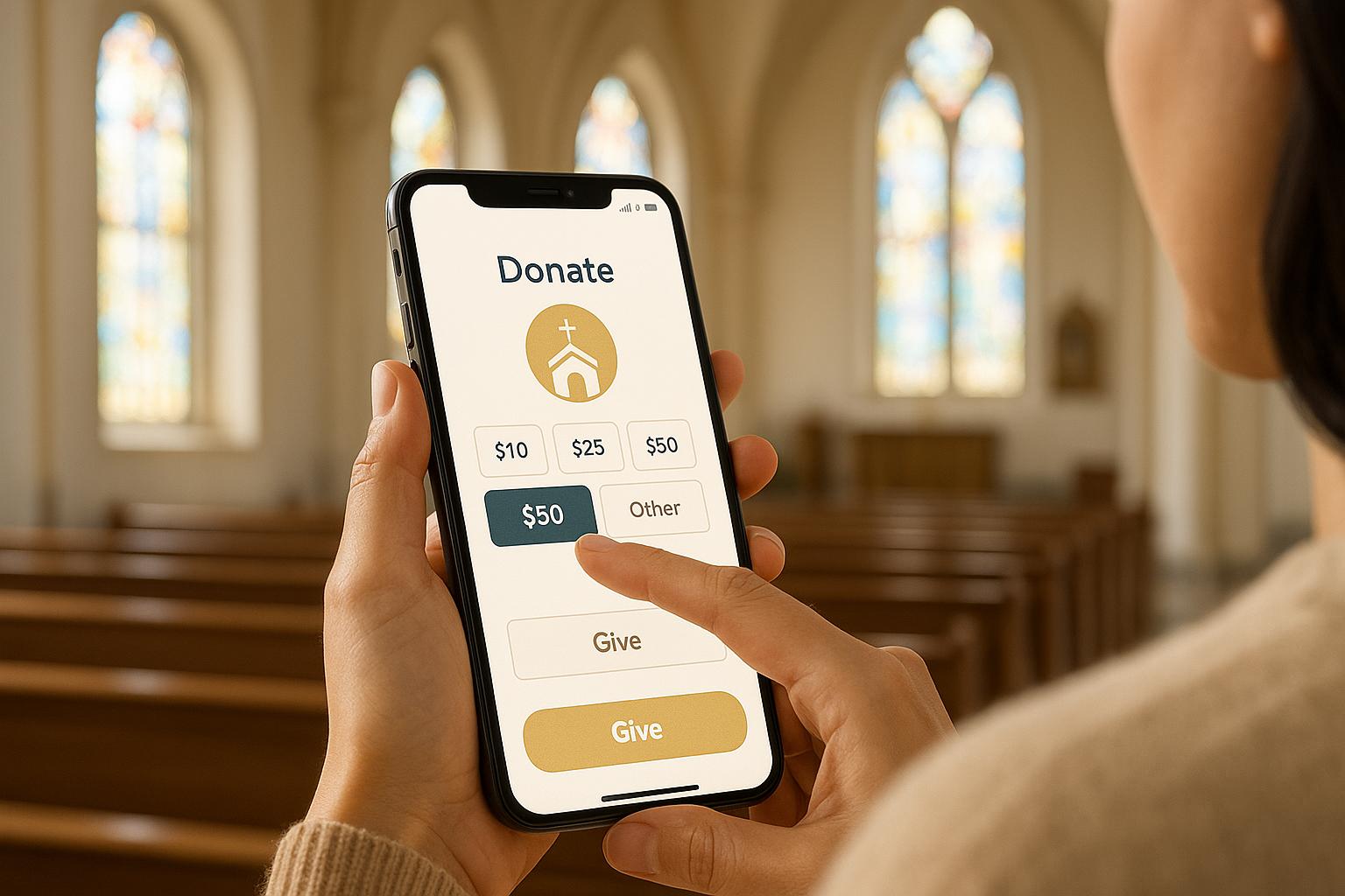
Best Practices for Mobile Church Donation Pages
.png)
Matt Lombardi
Founder
Want to increase donations for your church? Start with a mobile-friendly donation page. Here's why it matters and how to make it work:
A mobile donation page isn’t just about transactions - it’s a way to deepen connections with your congregation while making giving easy and secure. By focusing on simplicity, speed, and trust, you’ll create a better experience for donors and boost your church’s mission.
How To Increase Online Church Donations (Best Practices)
Mobile-First Design Principles
Designing donation pages that perform well on smartphones and tablets requires a mobile-first approach. This means starting with smaller screens in mind and then adapting the design for larger devices, rather than trying to shrink desktop layouts to fit mobile formats.
Create Simple and Clean Layouts
For mobile donation pages, single-column layouts are the way to go. They create a natural top-to-bottom flow and remove the need for horizontal scrolling, keeping the user experience smooth and intuitive. A clean, distraction-free design makes it easier for donors to move from your ministry's message straight to the donation form, increasing the chances they’ll complete the process.
Make sure tap targets - like donation buttons, amount selectors, and form fields - are at least 44 pixels in size. This ensures they’re easy to use for all finger sizes and minimizes accidental clicks. Space these elements apart so donors can tap the right option without frustration.
Text readability is equally important. Use a minimum 16px sans-serif font (like Arial or Helvetica) so donors can read the content without zooming in. This is especially helpful for older members of your congregation who may have vision difficulties.
Incorporate white space strategically to highlight important elements, such as donation buttons, and to make the page feel less cluttered. If the donation form is complex, break it into steps, showing additional fields (like recurring donation options) only when necessary. This keeps the process straightforward and less intimidating.
Finally, even the best layout won't matter if your page takes too long to load. Ensuring fast performance is key to keeping donors engaged.
Optimize for Fast Loading Times
A donation page that loads in 3 seconds or less is essential to prevent drop-offs, especially for spontaneous donations during or after services.
Start by compressing and optimizing all images before uploading them. Large photos, like hero images or ministry visuals, can slow down your page. Use modern formats like WebP and implement responsive images that adjust to different screen sizes.
Keep things streamlined by removing unused plugins and scripts. Each extra element adds server requests, which can hurt loading speeds. Hosting your page on a fast server with a Content Delivery Network (CDN) can also make a big difference. A CDN serves your content from servers closest to your donors, cutting down on load times.
Test your page on real devices, including those with slower 3G connections, to ensure it performs well for all users. This is especially important for rural congregation members who may not have high-speed internet.
Lastly, use lazy loading for non-essential content, but make sure the donation form and key calls-to-action load immediately. This way, donors can act quickly without waiting for unnecessary elements to appear.
Secure and Reliable Payment Processing
Building trust with donors starts by showing them that their personal and financial information is safe. When members of your congregation decide to donate via their smartphones, they need to see clear signs of security. These measures not only protect their data but also reinforce the mobile-first design principles we've touched on earlier.
Show Security Indicators
The first step in creating a secure experience is ensuring your donation page has an SSL certificate. This encrypts the data shared between the donor's device and your server, and displays a padlock icon in the browser's address bar. Always check that your donation page URL begins with "https://" - this signals a secure connection.
Displaying PCI compliance badges and trust seals from well-known security companies like Norton, McAfee, or Trustwave near your donation form can further reassure donors. These seals show that your site meets strict standards for handling payment data and has been tested for vulnerabilities.
Additionally, include a simple privacy statement or a link to your full privacy policy directly on the donation page. A short message like, "Your information is secure and will never be shared", can address common concerns without overwhelming the page with too much text.
When it comes to security messaging, aim for clarity without overloading donors with technical details. Use straightforward phrases like, "Your donation is protected with bank-level encryption", or, "We use secure, encrypted technology to process your gift."
Select Reliable Payment Processors
The payment processor you choose plays a major role in ensuring a smooth and secure donation experience. Look for processors with a strong track record of working with nonprofits and churches. Features like fund designation options, recurring gift management, and donor communication tools can make a big difference.
Since mobile giving is a priority, choose a processor with forms that are easy to navigate on smartphones and tablets. Buttons and fields should be large enough to tap, and the process should flow smoothly on smaller screens.
Be mindful of processing fees - credit card fees typically range from 2.9% to 3.5%, while ACH transfers often have lower, flat fees. Also, opt for processors that deposit funds quickly, ideally within 1-2 business days, instead of holding them for long periods.
Customer support is another key factor. Donation issues can arise, and having access to knowledgeable support staff - especially those experienced in working with religious organizations - can save time and frustration.
Finally, consider the integration capabilities of the processor. Many options connect directly to church management software, simplifying donor tracking, communication, and tax receipt generation.
Payment Options Comparison
Offering the right mix of payment methods ensures you meet the preferences and comfort levels of your congregation. Here's a quick look at the most common options:
Payment Method
Speed
Fees
Mobile Experience
Best For
Credit/Debit Cards
Instant
2.9% - 3.5%
Excellent - familiar process
One-time and recurring gifts
ACH/Bank Transfer
3-5 business days
$0.30 - $1.50 per transaction
Good - requires bank details
Large donations, lower fees
Instant
Same as card rates
Excellent - one-touch giving
iPhone users, quick donations
Instant
Same as card rates
Excellent - streamlined process
Android users, repeat donors
Instant
2.9% + $0.30
Good - requires PayPal account
Donors who prefer PayPal
Credit and debit cards are the most widely used option, thanks to their familiarity and ease of use. Many devices also offer auto-fill features, speeding up the donation process.
For larger gifts, ACH transfers are a smart choice due to their flat fees. However, donors need to input routing and account numbers, which can be a hassle if they don't have that information readily available.
Mobile wallets like Apple Pay and Google Pay provide the easiest experience for smartphone users. With just a fingerprint or face recognition, donors can complete their contributions in seconds. That said, not everyone - especially older members of your congregation - may use these options.
PayPal offers a secure middle ground. Donors can avoid entering card details directly, but they’ll need to log into their PayPal account or create one.
To keep things simple, offer a mix of payment options that meet most needs without overwhelming donors. A combination of credit/debit cards, one mobile wallet option (based on your congregation's device preferences), and ACH transfers ensures broad coverage while maintaining a clean, user-friendly interface.
Multiple Donation Options
Providing a variety of donation methods can make the giving process smoother and more appealing for donors. By aligning options with different giving preferences and budgets, you not only increase the chances of completing a donation but also encourage repeat contributions.
Offer Preset and Custom Donation Amounts
Preset donation amounts, such as $25, $50, $100, or $250, can guide donors and even nudge them toward contributing more. These preset amounts should be based on historical giving trends. For instance, if most donors tend to give within a modest range, you could set slightly higher amounts to inspire generosity.
Highlight the most popular or recommended amount prominently to attract attention. At the same time, always include a Custom Amount field. This ensures donors can give exactly what they want - whether it's a small gesture or a larger contribution. By offering both preset and custom options, you cater to a wide range of financial situations and preferences.
Set Up Recurring Giving
Recurring donations provide a reliable income stream for your church and make it easier for donors to support your mission over time. Adding a simple toggle labeled "Monthly gift" allows donors to switch between one-time and recurring contributions effortlessly.
Use the donation form to explain how recurring gifts make a difference. For example, a message like "Your monthly support helps sustain our ministry year-round" helps donors see the tangible impact of their ongoing generosity.
Make the process seamless by integrating the frequency selection with the donation amount step. Donors should be able to complete their gift without navigating additional pages or forms. To encourage recurring giving, consider setting "Monthly gift" as the default option, while still allowing an easy switch to one-time donations. This approach gently promotes ongoing support without creating pressure.
Donation Frequency Options Impact
Offering different donation frequencies appeals to a broader audience and impacts donor retention and revenue in unique ways. Clearly communicating these options helps donors understand their significance.
Frequency
Donor Retention
Average Gift Size
Revenue Predictability
Best For
Monthly
Highest retention
Lower per gift
Most predictable
Regular, budget-friendly contributions
Quarterly
Moderate retention
Moderate
Moderately predictable
Seasonal giving and project-based support
Annual
Lower retention
Highest per gift
Least predictable
Major gifts and year-end campaigns
Monthly giving often leads to higher donor retention, as smaller, regular contributions are easier to manage. Quarterly donations work well for seasonal campaigns, while annual gifts, though larger, can be less consistent.
To maximize success, most mobile donation pages offer all three frequency options, with a particular emphasis on monthly giving. Strategic placement and clear messaging can encourage donors to choose recurring gifts, complementing a secure and user-friendly payment system. This thoughtful approach not only enhances donor satisfaction but also strengthens retention efforts over time.
Clear and Visible Call-to-Action
The donation button is the critical link between a donor's intent and the act of giving. It’s the final step that turns interest into action, especially on mobile devices where screen space is tight and attention spans are fleeting. That’s why your call-to-action (CTA) needs to stand out and work effectively to encourage donations.
Design Easy-to-See Donation Buttons
The design and placement of your donation button can make or break the giving experience. On mobile screens, it’s essential to position the primary donation button at the very top, ensuring it’s immediately visible without any scrolling. This prime spot should be reserved for your key conversion element.
Color contrast is a game-changer for visibility. Choose colors that pop while staying true to your church’s branding. For instance, bright tones like orange or green against a light or white background can grab attention instantly. Avoid using too many colors that might overwhelm or confuse visitors about where to click.
Size is equally important. Follow the 44-pixel size guideline to ensure the button is easy to tap, even on smaller screens. The button should also be wide enough to display clear, legible text. A button that’s too small can frustrate users, while a well-sized one feels intuitive and inviting.
Keep the button text short and action-driven. Phrases like "Give Now," "Donate Today," or "Support Our Mission" are simple yet effective. They create a sense of urgency while staying warm and aligned with your church’s tone.
Subtle design touches like shadows or rounded corners can make the button feel more clickable. These elements help it stand out from surrounding content. However, steer clear of overly decorative designs that could slow down page load times or look unprofessional. An uncluttered, clean design ensures the button remains the focal point.
A well-designed donation button not only grabs attention but also sets the stage for impactful messaging.
Use Direct and Clear Messaging
Once your donation button is prominently displayed, the surrounding text should support and enhance its purpose. The words you use can inspire visitors to take action, so your messaging should tie the donation directly to your church’s mission and the difference it makes.
Connect your call-to-action to a specific impact, such as "Help us reach 500 families this month" or "Support our youth ministry programs." This approach is far more compelling than a generic request for financial support.
Incorporate language that promotes a sense of community. Phrases like "Join fellow members in supporting our mission" or "Be part of something bigger" remind donors they’re contributing to a shared purpose alongside their church family.
Adding time-sensitive language can also encourage immediate action. Words like "today," "now," or "this week" create urgency without feeling pushy. For seasonal campaigns or special events, tie your messaging to specific timeframes that resonate with your church calendar.
Tailor your tone to match your congregation’s values and expectations. Some churches may benefit from a friendly, conversational tone, while others might see better results with a more formal approach. The key is to ensure the language feels authentic to your church’s voice.
Place short, reassuring text near the donation button to address common concerns. For example, mention security features, tax-deductibility, or the immediate impact of their gift. These details not only reduce hesitation but also build trust in the donation process, reinforcing the safe and meaningful experience your church provides.
Effective Storytelling and Branding
After ensuring strong design and secure payment methods, the next step is to focus on the story your donation page tells. This isn't just about processing payments - it's about creating an emotional connection. When donors land on your mobile giving page, they’re seeking a reason to care, to feel connected to your mission. That’s where storytelling and consistent branding come in. Together, they act as a bridge, turning a visitor’s interest into a decision to give. These elements build on the trust you've already established through clear design and secure systems.
The best church donation pages go beyond simply asking for funds - they invite donors to become part of a story. Your branding reassures donors, while your stories illustrate how their contributions bring meaningful change to real lives.
Share Ministry Success Stories
Nothing connects with donors like real stories of transformation. Generic appeals may fall flat, but specific examples of lives changed by your ministry can leave a lasting impression. When donors see the direct impact of their gifts, they’re more likely to feel inspired to give.
For example, instead of saying, "We help families in need", share a personal story. Talk about Sarah, a single mom who turned to your food pantry during a tough time and later found stable employment through your job training program. This kind of storytelling helps donors visualize the immediate difference their generosity makes.
Gather testimonials from people whose lives have been touched by your ministry - whether they’re beneficiaries, volunteers, or even other donors. Use their own words to ensure authenticity, and include names and photos (with permission) to build trust.
Make sure these stories are presented in formats that work well on mobile devices. Short, heartfelt quotes are perfect for smaller screens, while brief videos can leave a strong impact - just ensure they load quickly. Written stories should be concise, capturing the transformation in just a couple of sentences.
Place your most compelling story at the top of your donation page. This ensures it’s seen right away, creating an emotional connection before donors even explore giving options. Highlight stories like a youth program graduate now thriving in college, a community member helped during a crisis, or a volunteer whose life was enriched through service.
Keep your content fresh by updating stories regularly. Seasonal stories are especially effective - share how Christmas toy drives brought joy to families or how summer camp scholarships opened new doors for children. This not only keeps repeat visitors engaged but also showcases the ongoing impact of your ministry.
Pair these stories with strong visuals to create a well-rounded and memorable donor experience.
Use Quality Visuals and Consistent Branding
A consistent visual identity reinforces the trust and user-friendly experience you’ve built. Your donation page should reflect your church’s branding through colors, logos, and fonts. This consistency helps donors instantly recognize your church and feel confident in the legitimacy of the giving process.
High-quality images play a crucial role in shaping how donors perceive your ministry. Use real photos of your church’s work - volunteers in action, youth programs, or community events. Authentic visuals, as opposed to stock images, build credibility and show that donations directly support real, local efforts.
Your church’s logo and color palette should be prominent but not overwhelming. Use brand colors for buttons, headers, and accents, ensuring good contrast for readability. Place the logo in a visible spot, like the header, to reinforce trust and familiarity.
Short videos can also be highly effective, especially for mobile users. A quick 30-second clip showcasing your ministry in action can communicate more than paragraphs of text. Just make sure videos are optimized for mobile - fast loading times and proper display on small screens are essential.
When selecting visuals, consider the diversity and values of your congregation. Use images that reflect your community’s demographics and highlight the welcoming nature of your church. This helps potential donors see themselves as part of your ministry’s story.
Strategically place impactful images throughout the donation page. Use them to break up text and reinforce your message. But don’t overdo it - too many visuals can slow down loading times and overwhelm mobile users. Balance is key.
Visual Element
Best Practice
Impact on Mobile Giving
Photos
Use real ministry images, avoid stock photos
Builds trust and shows authentic ministry work
Logo Placement
Position prominently in the header
Increases recognition and reinforces legitimacy
Color Consistency
Match church website and materials
Creates a cohesive and professional experience
Video Content
Keep under 30 seconds, optimize for mobile
Communicates impact quickly and effectively
To ensure your visuals resonate with donors, balance emotional appeal with technical efficiency. Mobile users may face slower internet speeds or challenging lighting conditions, so optimize file sizes for smooth performance. By paying attention to these details, you’ll make sure your stories and branding reach donors effectively, no matter their device or connection speed.
sbb-itb-deea482
Simple Navigation and Accessibility
Once you've nailed down compelling storytelling and consistent branding, the next step is making sure your donation page is easy to use for everyone. Even the most stunning, well-branded page won’t make an impact if donors can’t navigate it or if certain people feel excluded. By focusing on simple navigation and accessibility, you create an inclusive experience that welcomes all donors, regardless of their technical skills or physical abilities.
Mobile users, in particular, face unique challenges. They’re often multitasking, working with smaller screens, and may have limited time or attention. At the same time, users with disabilities need specific features to engage with your content. Addressing these needs not only boosts your fundraising potential but also reflects a commitment to inclusivity. These improvements build on secure design and storytelling strategies to keep donors engaged and encourage ongoing support.
Simplify Navigation for Mobile Users
Navigation on mobile devices is a different ballgame compared to desktops. What works on a large screen can quickly become cluttered and confusing on a smartphone. The goal? Make it as easy as possible for donors to go from landing on your page to completing their gift in just a few taps.
Start by cutting down your menu options. Most mobile users visiting a donation page have a single goal: to give. Everything else is secondary. Use a collapsible "hamburger" menu for less-critical links and keep the most important navigation elements front and center. A prominent "Give" or "Donate" button in a consistent, easy-to-find spot can make all the difference.
Take First Lutheran Church and School in Fort Smith, Arkansas, as an example. They saw a rise in giving activity after placing a bold "GIVE" link in the top-right corner of their website, making it accessible from every page.
Make sure donors can access your donation form from multiple entry points. Whether they’re on a sermon page or reading about an event, they should be able to give without having to backtrack. Embedding donation buttons or tiles on key pages can capture those moments when donors feel inspired to contribute.
Use clear, straightforward labels for navigation elements. Avoid insider jargon and stick to terms like "Give Now" or "Donate." Keep your page structure logical and shallow - if donors have to click through more than two or three pages to complete their gift, they’re likely to give up. The ideal flow is simple: landing page → donation form → confirmation.
Testing navigation on real mobile devices is crucial. Touchscreen behavior is different from mouse clicks, and factors like outdoor lighting or one-handed use can reveal issues that desktop testing might miss.
While streamlined navigation is essential, accessibility ensures that all donors can complete their gifts.
Meet ADA Compliance Requirements
Accessibility isn’t just a nice-to-have - it’s a legal requirement under the Americans with Disabilities Act and a moral responsibility for organizations that aim to welcome everyone. Beyond compliance, accessible design often improves usability for all users.
Start with screen reader compatibility. People with visual impairments rely on software to read webpage content aloud, so every image, button, and form field needs descriptive alt text. Instead of generic labels like "button", use specific descriptions such as "Donate $50 monthly to children’s ministry."
ARIA labels are another must-have. These labels help assistive technologies understand the purpose of interactive elements, ensuring that required fields, error messages, and confirmation steps are clearly communicated.
Color contrast is equally important. Many users struggle to read low-contrast text or distinguish similar colors. Stick to high-contrast combinations, like dark text on a light background, to make your content easier to read - especially on mobile devices.
Interactive elements should also be easy to tap. A minimum size of 44 x 44 pixels ensures that buttons and links are accessible for users with motor difficulties. Additionally, your page should support full keyboard navigation for those who can’t use touchscreens. Every interactive element should follow a logical tab order that mirrors the natural flow of your donation process.
Accessibility Feature
Implementation
Benefit
Alt Text
Detailed descriptions for images and buttons
Helps screen reader users understand visual content
High Contrast
Dark text on light backgrounds, minimum 4.5:1 ratio
Improves readability for users with visual impairments
Large Touch Targets
Minimum size of 44 x 44 pixels
Makes it easier for users with motor challenges
Keyboard Navigation
Logical tab order for all elements
Ensures usability without a touchscreen
Testing with assistive technologies like VoiceOver or TalkBack is essential. Automated tools can catch some issues, but hands-on testing often reveals problems that might otherwise go unnoticed.
Donation pages optimized for mobile and accessibility see 34% more contributions compared to non-optimized pages. Plus, accessible design tends to improve the overall user experience. When your donation process works well for users with disabilities, it often works better for everyone.
If you’re unsure where to start, consider partnering with organizations that specialize in nonprofit digital accessibility. Share Services, for example, offers tailored solutions for creating mobile-friendly, accessible donation pages that meet ADA requirements. These efforts not only help you connect with more supporters but also foster stronger donor relationships over time.
Multiple Mobile Giving Methods
Expanding on the idea of accessible design, offering a variety of mobile giving options ensures you cater to the diverse preferences of your congregation. With smartphones doubling as powerful payment tools, churches can harness these technologies to make donating easy and barrier-free. By doing so, you create a donation experience that feels effortless and inclusive for everyone.
The key takeaway? Different people favor different ways to give. Some prefer the ease of texting a number, while others feel more secure using their mobile wallet. By offering multiple ways to contribute, you not only increase donations but also make giving more accessible to all.
Add Text-to-Give and QR Codes
Text-to-give campaigns transform any smartphone into a quick donation tool. Donors simply text a keyword to a specific number and follow a short, guided process to complete their donation. This approach is especially effective during services, events, or urgent fundraising efforts when immediate action is needed.
Setting up text-to-give is simple. Choose an easy-to-remember keyword like "GIVE" or "MISSION" and display it prominently during services with clear instructions: "Text GIVE to 12345 to donate $25." There's no need for app downloads or complicated navigation.
QR codes work similarly but offer more flexibility. You can print them on bulletins, project them on screens, or include them in mailings. When scanned, these codes direct donors to a mobile-friendly donation page, often with additional giving options. Unlike text-to-give, QR codes allow for more detailed contributions while still keeping the process straightforward. Both methods are excellent for capturing those spur-of-the-moment giving opportunities. Whether a pastor shares an urgent need or celebrates a ministry success, these tools let donors act immediately without hassle.
Accept Mobile Wallet Payments
Mobile wallets like Apple Pay, Google Pay, and Samsung Pay make donating even easier. These platforms securely store payment information and allow for one-touch transactions that feel almost instant. For churches, this means removing common donation barriers and speeding up the process.
Security is a major draw for donors when it comes to mobile wallets. Features like tokenization and biometric authentication (fingerprint or face recognition) make them safer than traditional card payments. Donors can confirm their contributions quickly without manually entering sensitive information.
To implement mobile wallet payments, you'll need a compatible payment processor. Most modern donation platforms already include these options, but it’s crucial to make them highly visible. Display mobile wallet logos prominently on your donation page so donors know they can use this option.
Mobile wallets also save time. What might take a few minutes with a traditional card can be done in under 30 seconds using a mobile wallet. This speed is particularly helpful during services or events where time is limited. Younger donors tend to adopt mobile wallets quickly, while older donors often appreciate the added security once they learn how the technology works.
Giving Methods Comparison
Giving Method
Ease of Use
Setup Complexity
Best Use Case
Typical Adoption Rate
Text-to-Give
Very High
Medium
Emergency appeals, in-service giving
High across demographics
QR Codes
High
Low
Bulletins, printed materials
Rapidly increasing
Mobile Wallets
Very High
Low
All donation scenarios
Highest among under-45 donors
Each method has its strengths. Text-to-give is perfect for urgent campaigns but comes with setup and maintenance costs, making it ideal for churches with active fundraising efforts. QR codes strike a great balance - they’re nearly free to implement and easy to update for different campaigns, though some donors may need guidance on how to scan them. Mobile wallets offer the smoothest experience but require a donation platform that fully supports them and makes them easy to find.
The most effective strategy? Use all three methods and promote them strategically. Text-to-give works best for urgent needs, QR codes excel for ongoing campaigns, and mobile wallets should be a standard option on every donation page. This ensures every donor can find a method that suits them.
Share Services specializes in helping churches integrate and optimize these mobile giving methods. Their expertise in nonprofit digital fundraising ensures seamless implementation with your existing systems, offering the security and reliability that donors expect.
Donor Retention and Follow-Up Methods
Once you've made mobile giving simple and accessible, the next challenge is keeping donors engaged. The goal is to transform one-time contributors into loyal supporters who feel genuinely connected to your church's mission. Achieving this requires thoughtful follow-up strategies that show appreciation and respect for their preferences.
The secret to donor retention lies in making people feel valued - not overwhelmed. A well-designed mobile donation page can help by offering clear, targeted options for staying connected, creating opportunities for meaningful engagement.
Offer Opt-Ins for Updates and Receipts
Your mobile donation page can be more than a transaction tool - it can help build relationships. Instead of automatically signing donors up for every communication, give them the choice to opt in to what matters most to them.
Include simple checkboxes on the confirmation page that allow donors to choose updates they care about, such as event invitations, ministry updates, or prayer requests. For example, you could offer opt-ins for weekly newsletters, impact stories, or specific ministry updates. This approach respects their preferences while giving you insight into what resonates with each donor.
Make tax receipts a priority, especially on mobile platforms. Many donors expect immediate email receipts, particularly during year-end giving when tax documentation is front of mind. Clearly explain how and when receipts will be sent, and provide an option for donors to update their email address if needed.
To keep donors engaged, consider sending monthly mobile-friendly updates. These updates could include photos, short stories, and specific examples of how donations are making a difference. For instance, instead of a generic message like "Your donation helped our food ministry", share a concrete story about how recent contributions provided meals or other services to families in need.
The key is to make these opt-ins feel like a benefit rather than a burden. Use donor-focused language, such as "Get monthly stories about how your generosity is changing lives", to highlight the value of staying connected. Since mobile users often skim, keep descriptions short and to the point.
Once you've set up these opt-ins, the next step is to encourage ongoing support through recurring giving.
Promote Recurring Giving Programs
Recurring giving takes donor engagement to the next level by providing steady, predictable support for your ministry. Your mobile donation page should make setting up recurring gifts simple and appealing without feeling pushy.
Position recurring giving as a primary option, but keep one-time donations accessible. Many churches use language like "Join our monthly ministry partners" to highlight recurring giving while ensuring donors feel free to make a single contribution if they prefer. This approach normalizes recurring gifts without pressuring anyone.
Simplicity is key when designing recurring giving options. Many donors appreciate preset monthly amounts - like $25, $50, or $100 - over complex or unusual options. Introduce the idea of recurring giving right after a donation, when goodwill is at its peak.
Organizations like Share Services excel at creating donor retention strategies that turn mobile giving into lasting relationships. Their approach to recurring giving emphasizes transparency: donors should know when charges will occur, how to adjust or cancel their gifts, and the specific impact their ongoing support will have. To avoid surprises, consider sending friendly reminder emails before each charge, especially for new recurring donors.
Flexibility is essential for long-term retention. Allowing donors to easily adjust their giving amount or frequency helps them feel in control rather than locked into a commitment. A seamless mobile design supports these flexible options. You might also consider recognizing recurring donors with exclusive updates, early event invitations, or personalized prayer requests to make them feel like valued members of your community.
Share Services: Supporting Mobile Giving Success
Navigating mobile giving can be tricky for churches, especially those without a dedicated tech team. That’s where Share Services steps in to help faith-based organizations fine-tune their mobile donation strategies.
Share Services partners with nonprofits bringing in $1–$20 million annually, offering tailored solutions like digital fundraising, brand development, and donor retention strategies. Their goal? To help mid-sized churches grow their mission and reach more people.
Their approach is all about integration. By combining mobile giving with tools like email marketing, social media campaigns, and targeted ads, they ensure your mobile donation page becomes a central piece of a larger donor engagement plan. This strategy builds on your mobile-friendly design to create a more connected and engaged donor base.
Here’s a breakdown of their pricing options:
In addition, Share Services offers recurring giving programs that transform your donation page into a platform for long-term donor relationships. This ensures your donors stay connected and engaged over time.
Conclusion: Key Points for Mobile Church Donation Pages
Designing a mobile donation page that works well requires blending technical efficiency with a meaningful spiritual connection. A clean, user-friendly layout and quick loading times are essential to keeping donors engaged and ensuring they complete their contributions instead of leaving halfway through.
Building trust and security is non-negotiable. Make sure to include visible security features and collaborate with reliable payment processors to reassure donors that their financial information is safe. Offering diverse payment options, such as mobile wallets and text-to-give, can make it easier for supporters to contribute to your ministry.
The impact of recurring donations is hard to ignore. On average, recurring gifts amount to $44 - almost twice the industry average of $24 - and 76% of these commitments last for at least a year. These consistent contributions provide the financial stability your church needs to focus on long-term goals.
Pay close attention to donor retention. Keeping an existing donor is up to five times less expensive than acquiring a new one [12,14]. However, with nonprofit donor retention rates sitting just below 35%, it’s critical to incorporate strategies like timely thank-you messages, clear updates on how donations are making a difference, and personalized follow-ups to maintain strong relationships.
Your mobile donation page is more than a tool for transactions - it’s an opportunity to deepen connections with your congregation and community. By focusing on intuitive design, engaging storytelling, secure payment systems, and strategies to retain donors, you create a platform that reflects both the generosity of your supporters and the mission of your ministry.
FAQs
How can we encourage recurring donations on our church's mobile-friendly donation page?
To inspire recurring donations on your church's mobile giving page, set monthly giving as the default option. Clearly explain how ongoing contributions play a vital role in sustaining your mission, whether it's funding community outreach programs or keeping church operations running smoothly. Highlight both the emotional fulfillment and practical impact of consistent giving to create a stronger connection with potential donors.
Make the donation process as simple as possible. Remove unnecessary fields that could slow users down, and ensure the 'Donate' button is highly visible and easy to tap. A smooth, hassle-free experience can significantly increase the chances of donors committing to regular contributions.
By keeping things straightforward and showcasing the meaningful difference recurring donations make, you can build trust and encourage long-term support from your donor community.
How can we make our mobile donation page accessible for everyone, including individuals with disabilities?
Creating a mobile donation page that’s easy for everyone to use means following the Web Content Accessibility Guidelines (WCAG). Start by adding alternative text for all visuals so users with screen readers can understand the content. Make sure the page is fully navigable using just a keyboard, and design it to work smoothly across different screen sizes and devices.
You might also want to include accessibility tools that let users customize things like font size, contrast, and other display settings to suit their preferences.
Focusing on accessibility ensures that every member of your congregation feels included and empowered to support your mission without any barriers.
How do mobile wallets and text-to-give options improve the church donation process and benefit donors?
Mobile wallets and text-to-give options have transformed the way people contribute to their churches, making the process quicker and more convenient. Mobile wallets offer a secure, contactless way to donate, letting people give effortlessly - whether they're attending a service or relaxing at home. On the other hand, text-to-give simplifies things even further, allowing donations to be made with just a single text message. It’s a great option for those with busy schedules or who prefer to give on the go.
These digital solutions don’t just make giving easier - they also provide peace of mind. Secure payment systems and automated receipts help build trust, while the reduced effort involved in donating often leads to more consistent contributions. By embracing these tools, churches can remove obstacles to giving and create stronger, more meaningful connections with their communities.
Related posts
- Creating Effective Online Fundraising Campaigns: A Guide
- The Future of Digital Fundraising: Trends to Watch
- How to Engage Donors Through Digital Channels
- How Peer-to-Peer Fundraising Works in Faith Networks
{"@context":"https://schema.org","@type":"FAQPage","mainEntity":[{"@type":"Question","name":"How can we encourage recurring donations on our church's mobile-friendly donation page?","acceptedAnswer":{"@type":"Answer","text":"<p>To inspire recurring donations on your church's mobile giving page, set <strong>monthly giving</strong> as the default option. Clearly explain how ongoing contributions play a vital role in sustaining your mission, whether it's funding community outreach programs or keeping church operations running smoothly. Highlight both the emotional fulfillment and practical impact of consistent giving to create a stronger connection with potential donors.</p> <p>Make the donation process as simple as possible. Remove unnecessary fields that could slow users down, and ensure the <strong>'Donate' button</strong> is highly visible and easy to tap. A smooth, hassle-free experience can significantly increase the chances of donors committing to regular contributions.</p> <p>By keeping things straightforward and showcasing the meaningful difference recurring donations make, you can build trust and encourage long-term support from your donor community.</p>"}},{"@type":"Question","name":"How can we make our mobile donation page accessible for everyone, including individuals with disabilities?","acceptedAnswer":{"@type":"Answer","text":"<p>Creating a mobile donation page that’s easy for everyone to use means following the <strong>Web Content Accessibility Guidelines (WCAG)</strong>. Start by adding alternative text for all visuals so users with screen readers can understand the content. Make sure the page is fully navigable using just a keyboard, and design it to work smoothly across different screen sizes and devices.</p> <p>You might also want to include accessibility tools that let users customize things like font size, contrast, and other display settings to suit their preferences.</p> <p>Focusing on accessibility ensures that every member of your congregation feels included and empowered to support your mission without any barriers.</p>"}},{"@type":"Question","name":"How do mobile wallets and text-to-give options improve the church donation process and benefit donors?","acceptedAnswer":{"@type":"Answer","text":"<p>Mobile wallets and text-to-give options have transformed the way people contribute to their churches, making the process quicker and more convenient. <strong>Mobile wallets</strong> offer a secure, contactless way to donate, letting people give effortlessly - whether they're attending a service or relaxing at home. On the other hand, <strong>text-to-give</strong> simplifies things even further, allowing donations to be made with just a single text message. It’s a great option for those with busy schedules or who prefer to give on the go.</p> <p>These digital solutions don’t just make giving easier - they also provide peace of mind. Secure payment systems and automated receipts help build trust, while the reduced effort involved in donating often leads to more consistent contributions. By embracing these tools, churches can remove obstacles to giving and create stronger, more meaningful connections with their communities.</p>"}}]}
Get helpful resources, straight to your inbox
We love sharing tools, ideas, and stories that make nonprofit work a little lighter and a lot more effective. Sign up below and we’ll send you practical tips, free resources, and a bit of encouragement—because the work you’re doing matters.
No spam. Just good stuff for good people.